

Introduction
CalOptima was in the middle of building a new Provider Portal to replace, Aerial, a 3rd party healthcare management software. Based on feedback from the Provider Relations team, I redesigned several modules addressing key problems that providers and support staff were having issues with.
Team
I was the lead designer for the Provider Portal team. I worked with 3 designers, scrum master, front and backend developers, quality assurance, and a product owner.
About CalOptima
CalOptima is a county organized health system that administers health insurance programs for low-income children, adults, seniors and people with disabilities in Orange County. CalOptima has over 100,000 contracted providers within their network that need 24/7 access to the CalOptima Provider Portal.

The Provider Portal must be complete in 1 year
Viewing Referrals
Researching and Defining the Problems
Research techniques used were, ethnographic studies, receiving live feedback from provider support staff, and heuristics.
Results driven from research: Too much PHI information exposed, not enough messaging around turnaround times, status icons were not clear, too much data all on one page was overwhelming for providers.
People Who View Referrals
Users who view referrals and create referrals are typically different. People who review referrals are nurses, utilization managers, doctors, and medical providers.
Addressing PHI Concerns Immediately
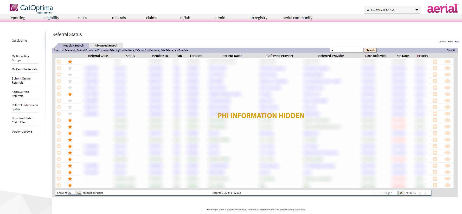
Even though the product would not be out immediately, we needed a solution to the business’s concern about showing too much referral results to users. Here is an example showing how by either searching * or just loading the page, the portal would return all referrals by default.
Example of Showing All Referrals on Page Load
Test Designs Using Live Data
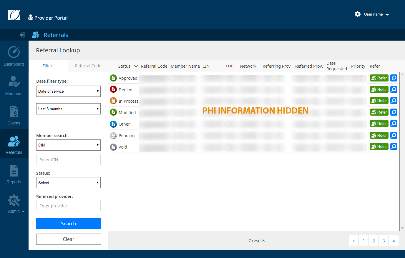
It turns out that testing live data proved to cause issues with the earlier design. The columns were too cramped and providers were frustrated with this design in tablet mode. It just wasn’t friendly enough for their iPads and even small laptops. This was enough to convince the business that the designs they wanted to build straight away, needed some extra work.
Previous Design Inherited TOO CRAMPED WITH LIVE DATA
Prioritizing Search Results
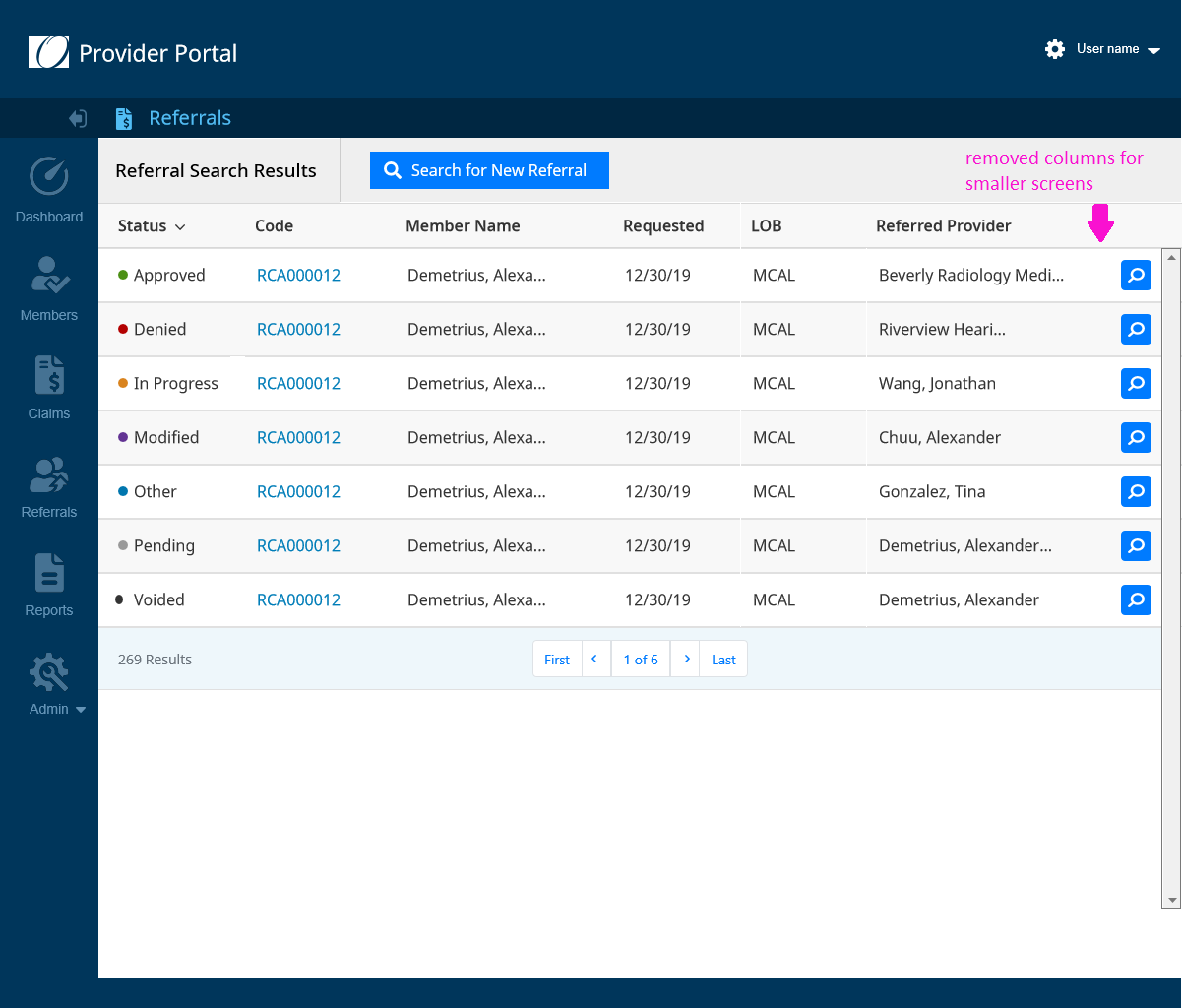
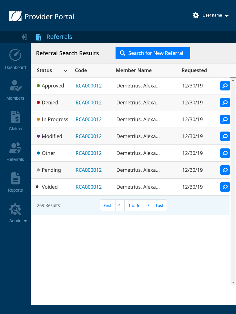
Through testing, we determined that live data was longer than what the mockups showed. The designs were only created for desktop screens and were not responsive. It was important to work with the Product Owner and the Provider Relations Team to get a hierarchy of what data elements were most important.
EXAMPLE OF Prioritizing column data for smaller screens
Coming Up with Concepts to Solve Space Issue
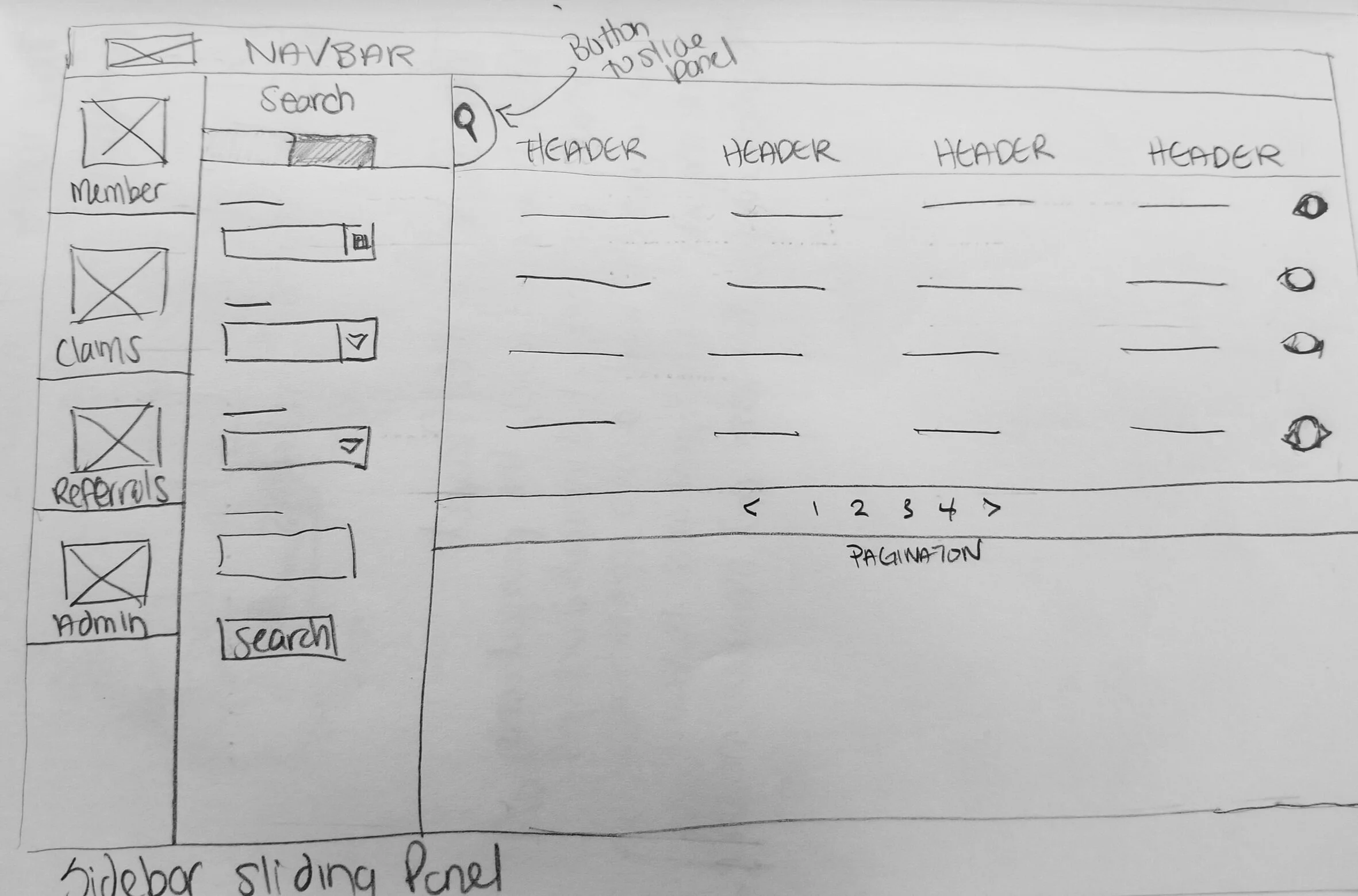
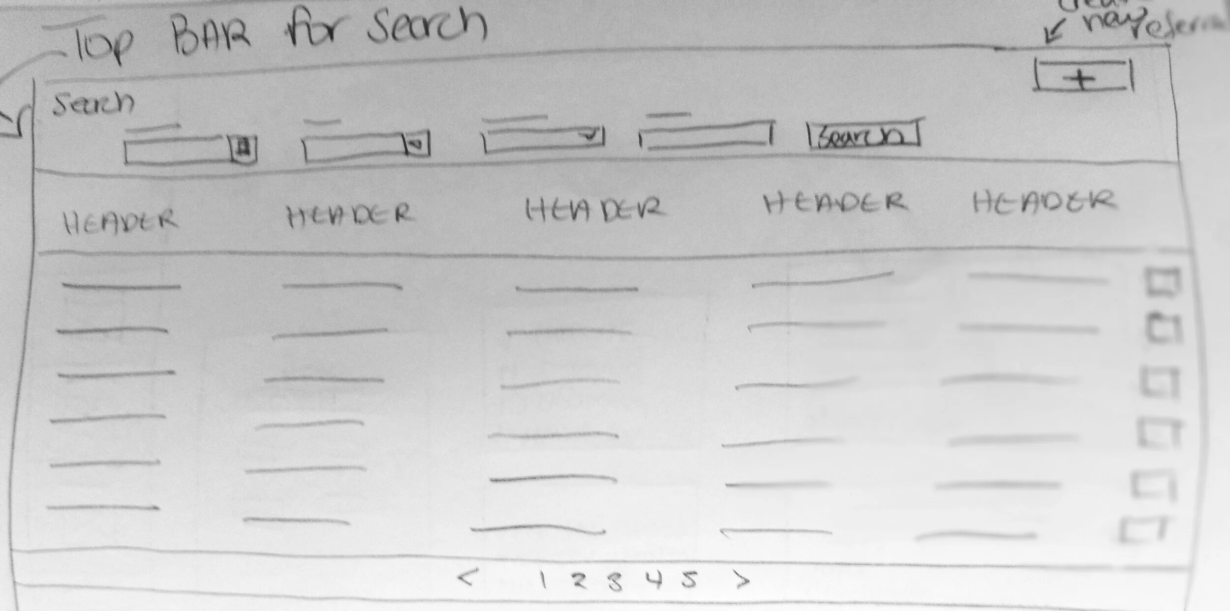
There were two concepts that we researched. The first one was having a sliding search panel. The second one was having a top search bar.
Key findings: It turned out that the sliding search bar was too complicated and 33% of users would forget about the hidden search. Users complained that the top search bar took too much room.
Initial Sketches for Referral Home Page
Wireframes Used for Testing
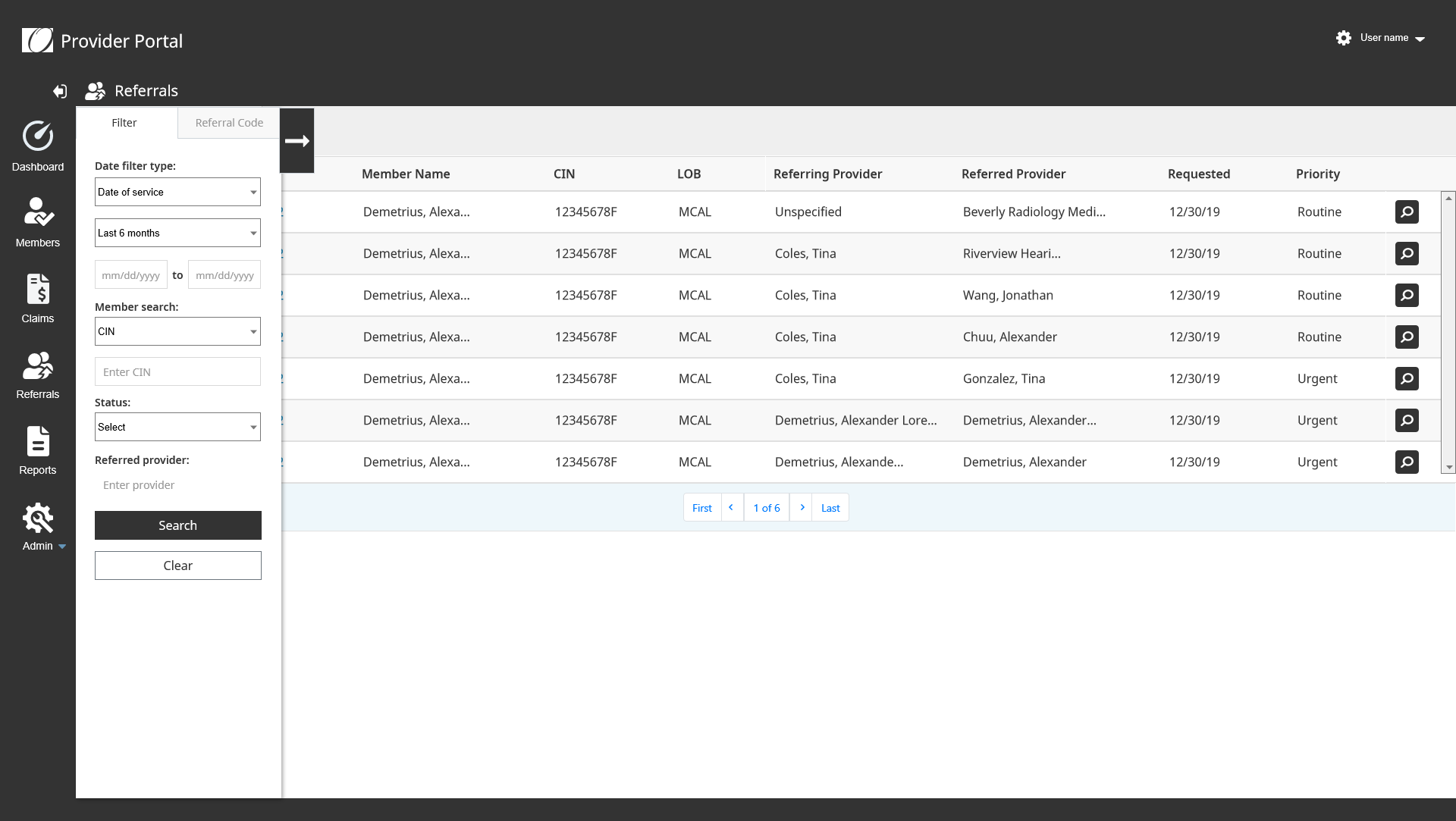
Sliding Panel Concept
Users liked the concept but during testing it turns out that people would forget to click the button to slide the panel back. It was a little awkward.
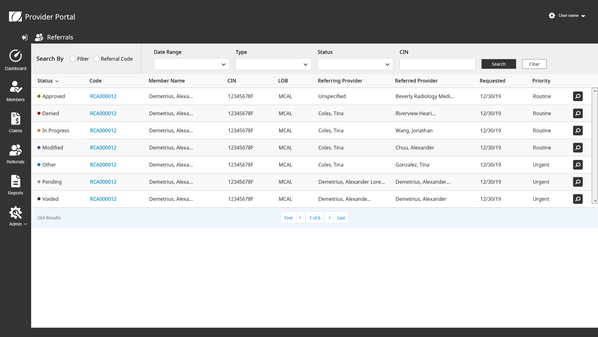
Top Search Bar Concept
People did not like this concept because it took away from seeing more results on the page.
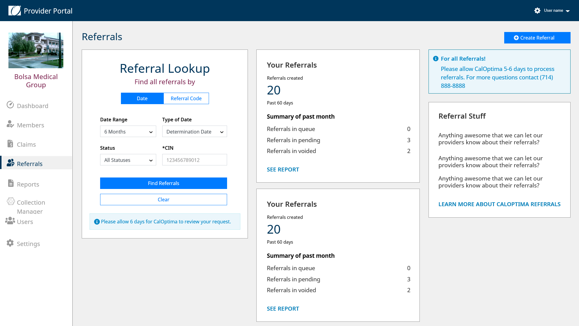
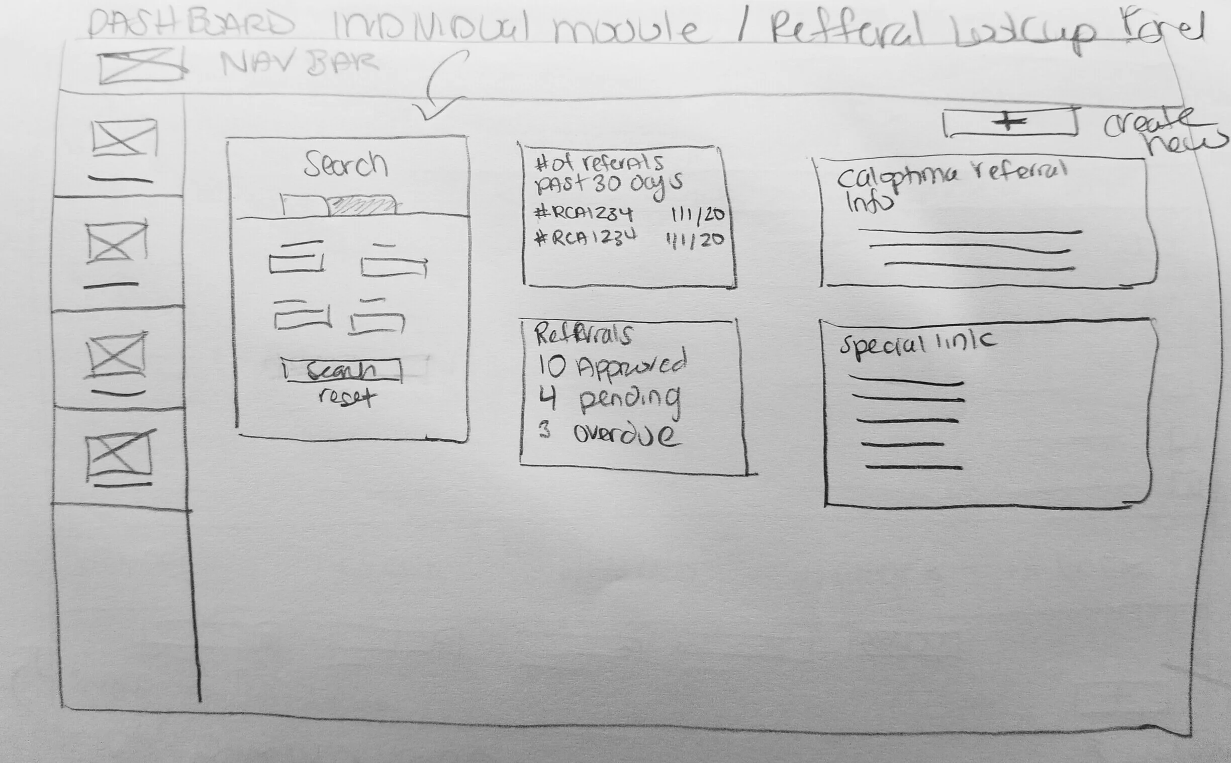
Dashboard Design Concept
The concept of each module having it’s own dashboard. Where users can view the latest information about that section. It could have CalOptima notices, links, instructions, and more.
Results: Proposed this design to the business and it was approved. Due to time, we would build the lookup panel for the release and build the other sections with more provider feedback.
Final Solution for Referral Home Page
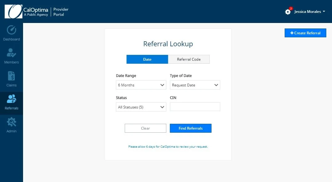
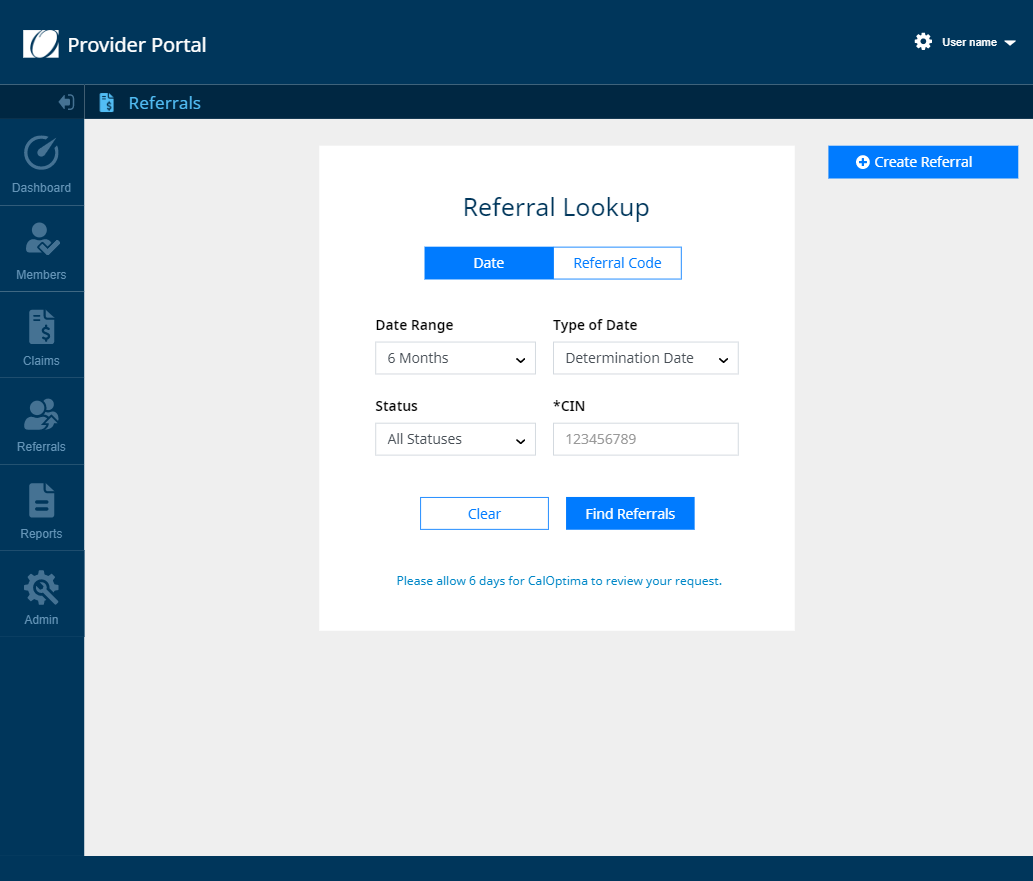
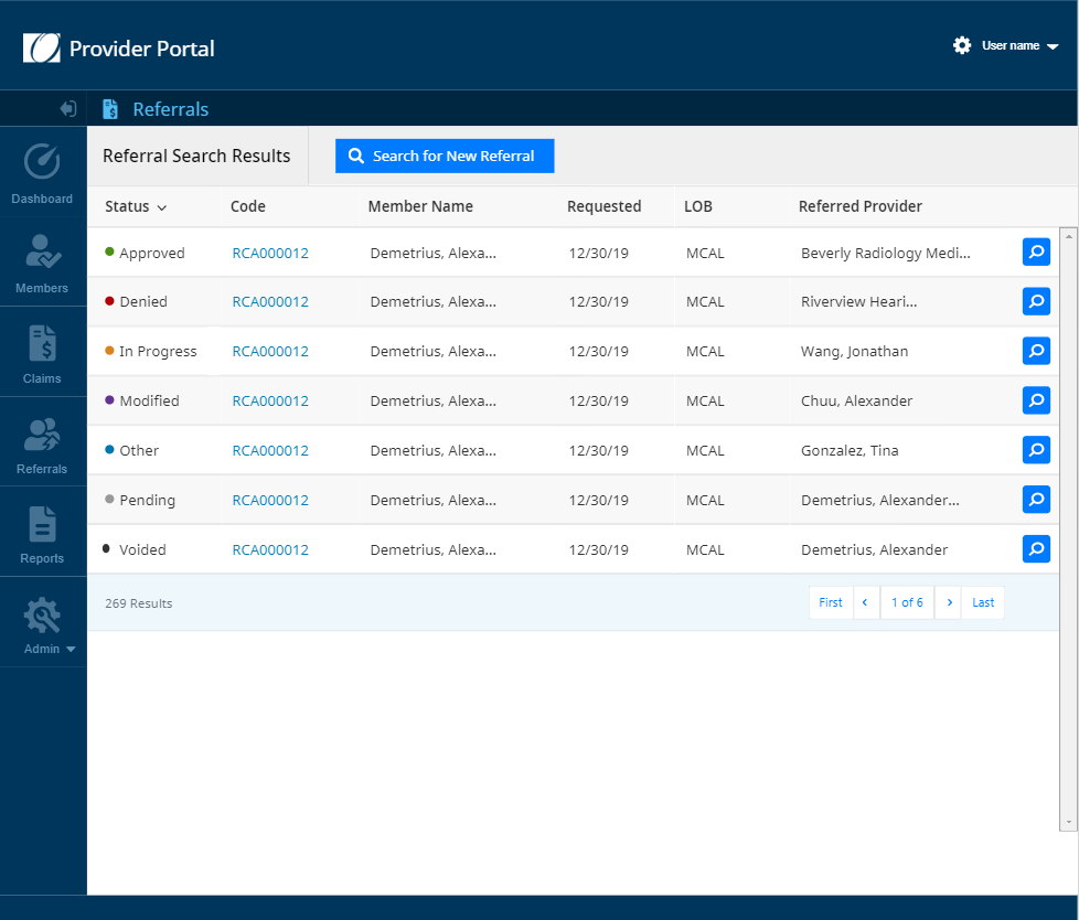
It turned out that combining the panel and top search bar concept allowed us to come to the final design, Referral Lookup Page. There is a dedicated page for performing the proper search, which solves the PHI issue, but when you want to search again on the results page, the top search button reuses the same lookup panel. Which was less work for the developers as well.
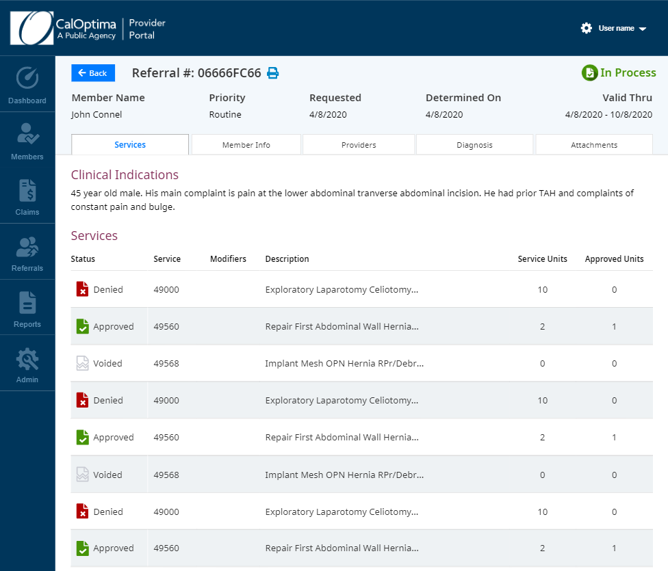
Results: After testing with the business stakeholders and users, the team concluded that our goal of removing PHI and making the data more responsive worked. 100% of the users naturally clicked on the button to get more information about a specific referral. There were no issues with the “Search” button as well.
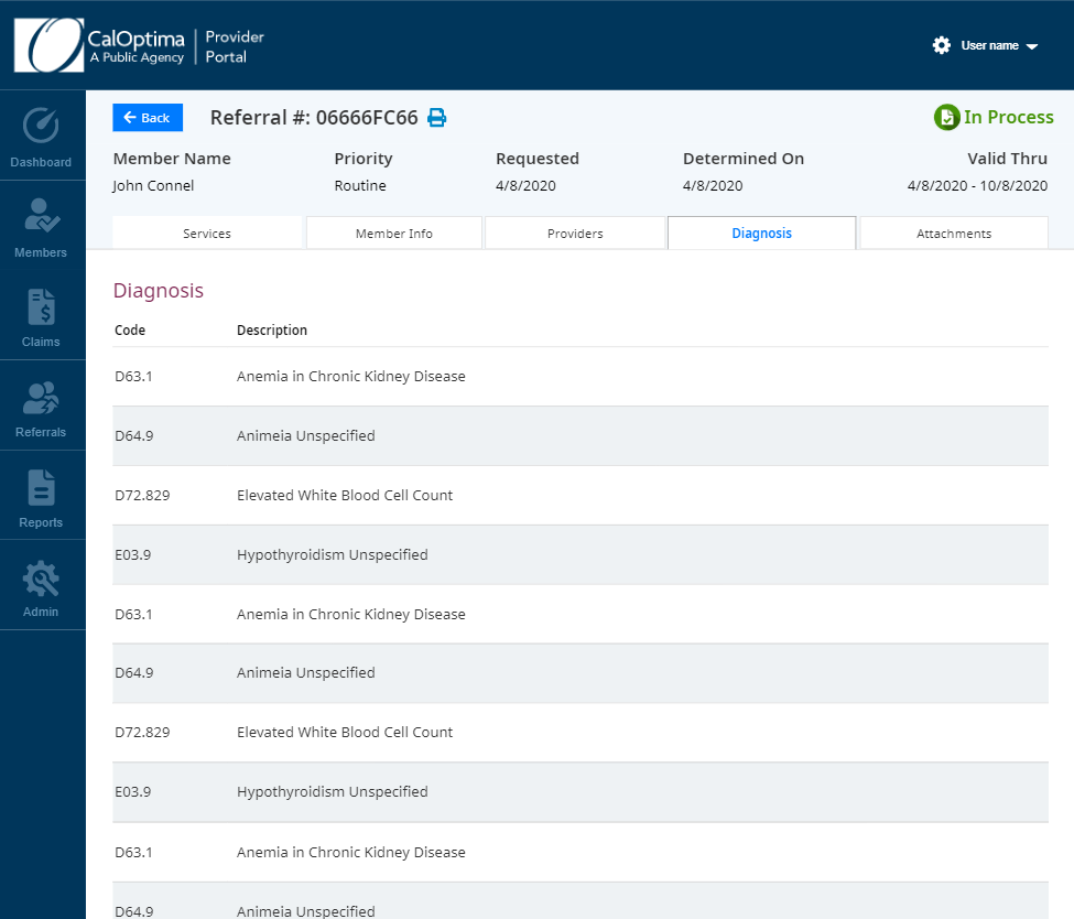
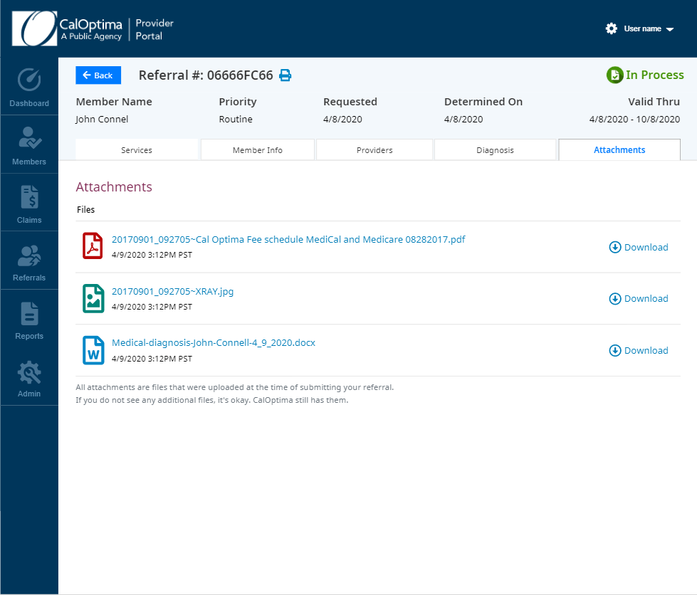
Final Mockups of Referral Home, Search Results, and Details Pages
Creating Referrals
Background Information
One of the biggest features in the Provider Portal is the ability for providers to refer their patients, or members, to another provider for medical services. This part of the referral module is the most complex with data, logic, and requires multiple systems.
Users
Providers, Medical Assistants, Nurses, Provider Relations Team, Utilization Managers, and Referral Coordinators.
Researching and Defining the Problem
Research techniques used were user interviews from providers, nurses, and the Provider Relations Team. Also discussion with the Product Owner and reviewing amount of support calls.
Results driven from research: Nurses are overwhelmed with the amount of pending requests inside their tool, Guiding Care. There were many support calls and complaints from providers about how long they would need to wait for referral requests.
Digging Deeper Into the Problem
By performing interviews with the nurses and the business, it turns out that many pending requests lack the correct clinical data and nurses must manually ask for this information from a provider.
Another issue has to do with auto approval. A referral can have multiple medical services attached to it. We determined through interviews and reviewing the referral queue in Aerial, that some referral requests were being automatically approved, however, most requests automatically were pending for review.
Why? A referral request can have multiple medical services. Technically, each medical service should either be approved or denied. However, it turns our that there was a flaw in Aerial’s design where the tool could only approve the request altogether and not by each medical service. If it was not automatically approved, the request went to a pending status. Therefore the queue for reviews was growing exponentially and slowing down processing time. Instead of days it could take over a week for a request to be processed.
An Industry Standard MCG
Researching MCG, the Industry Standard for Auto Approvals
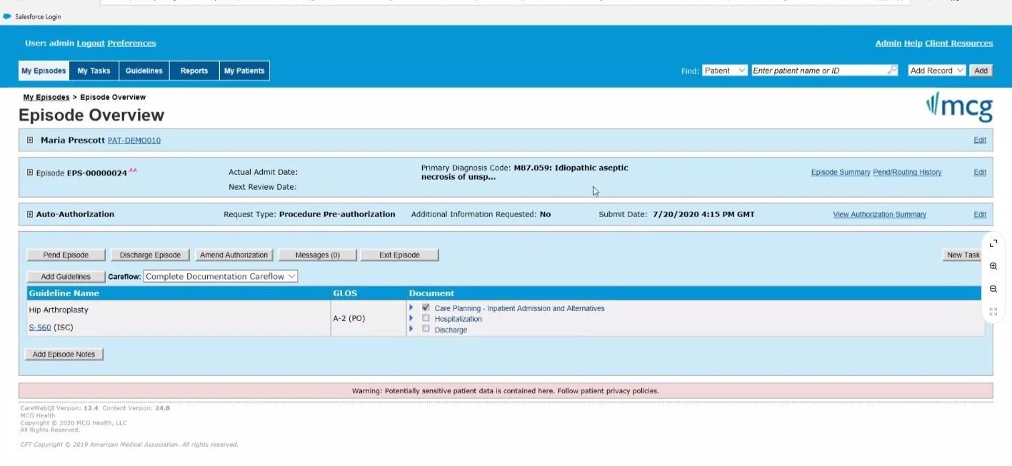
Since we knew the issue was a lack of an efficient auto approval system, the business began looking for alternatives. There were two vendor alternatives that did not need more development effort. MCG, and Alturista. Both vendors boasted about utilizing their API’s to pass important qualifying information back and forth between the systems and the Provider Portal.
The Proposed Method of Passing Data Via API
Working with Vendors, MCG and Alturista Was Not Flexible to Our Needs
Through several meetings, we found the only way to integrate with these tools would be to send users outside of the Provider Portal to the vendor’s website where they would need to complete more forms and then be redirected back to the Provider Portal to finish the referral submission. Overall the team decided that this was not the route we wanted our users to have. We would build our own approval intelligence system.
The Approval Intelligence System
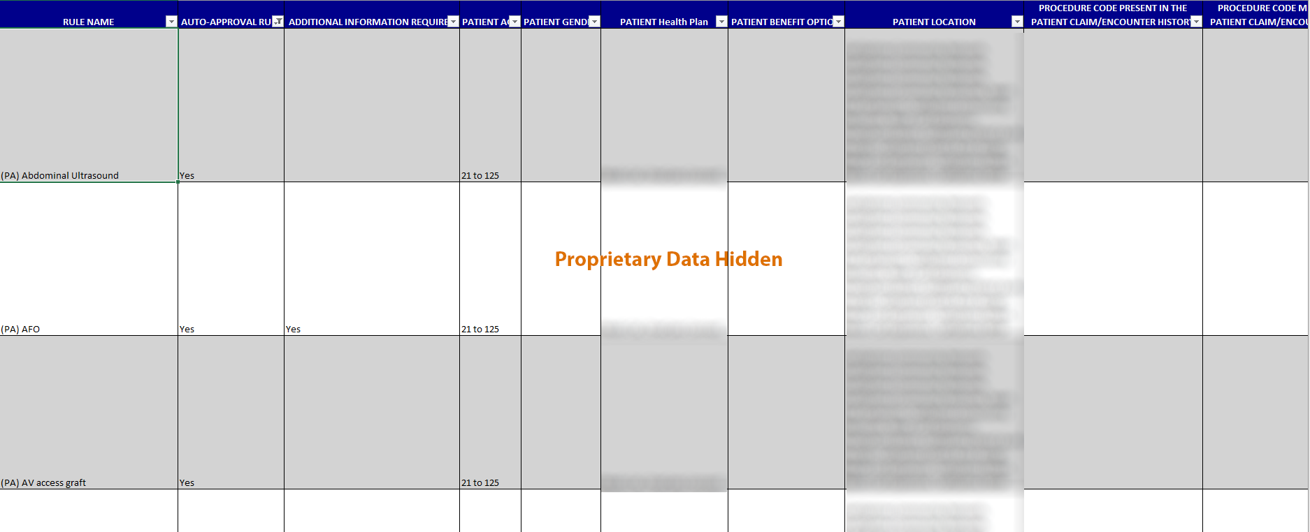
After working with the business, there were documents that nurses and several other teams used to ask qualifying questions of whether certain medical services would be approved. The team poured over this document and found most of the qualifying questions were simple. Mainly yes or no and maybe information such as age. The database and backend developers believed it would be possible to translate this document as the intelligence rules.
Screenshot of the Qualifying Questions Used
Medical Questionnaire
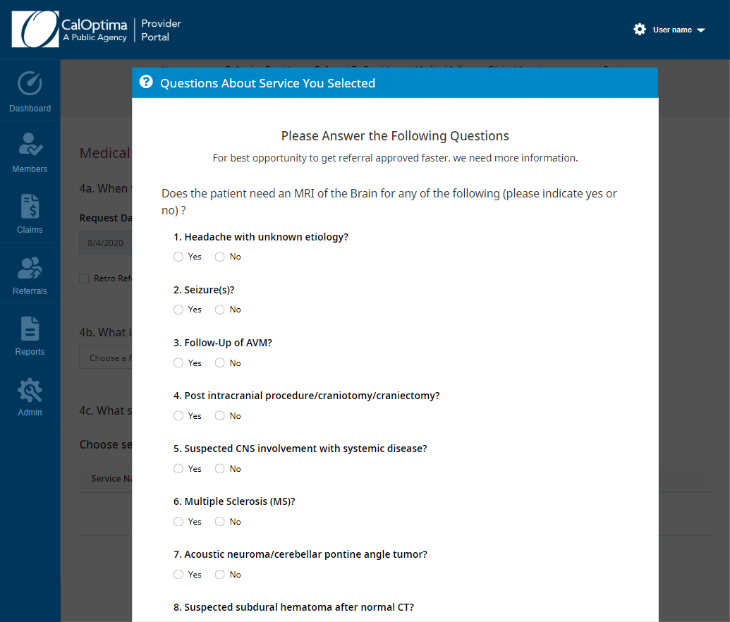
Based on technical feasibility and the approval of the business, we could design out a simple questionnaire for particular services that would be applicable for auto approval. By having the provider fill out a questionnaire, which is optional, they get a chance for auto approval. This means faster turnaround time for simpler referrals and less work on the nurses side.
Medical Services QuestioNnaire Concept
Reviewing the Current Referral Submission Process
Aerial Referral Submission Form
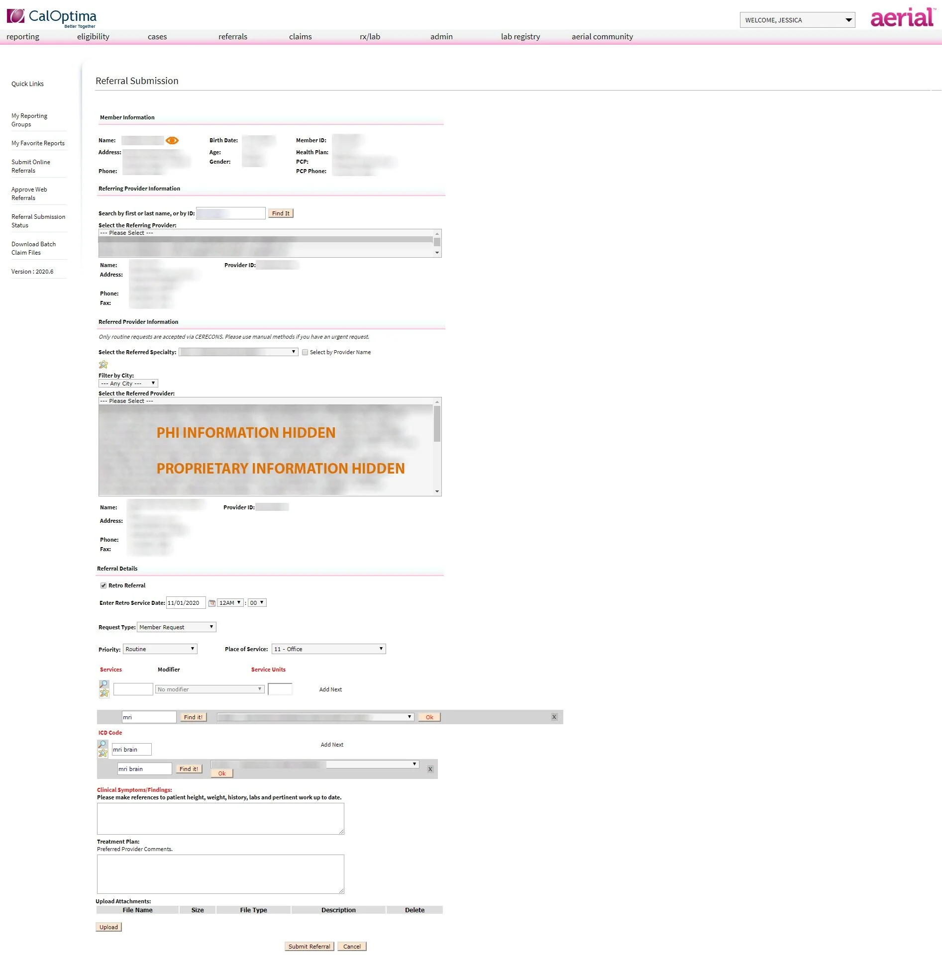
Referral All On One Page
It turns out speed was not helping our users give the proper information. When interviewing nurses who review pending referrals, clinical information was almost never supplied. During testing the clinical information and attachments section were overlooked entirely.
Mental Health Was Ignored
Aerial did not support mental health referrals. The current process allowed providers to submit mental health referral requests even when it was not supported.
Searching for Services Was Confusing
Adding the correct medical service or diagnosis was confusing in Aerial. Many users were able to complete the task because they do this regularly. However, it was a pain point that was heavily vocalized during a focus group session.
Choosing a Provider That is Incorrect
There were many ways to create errors in choosing a provider or member that was not supported or should not have been selected based on specialty, location, and etc. The current system was a simple select box without any logic checks.
Coming Up With Solutions
Through testing, we determined that speed wasn’t on our side when it came to getting accurate results. The first thing we would tackle is the referral layout itself. By taking a look at the form and the data, it could be broken down into 5 major steps. So it seemed natural to take the long form out of the equation and try something a little different.
Initial sketches for Referral Submission
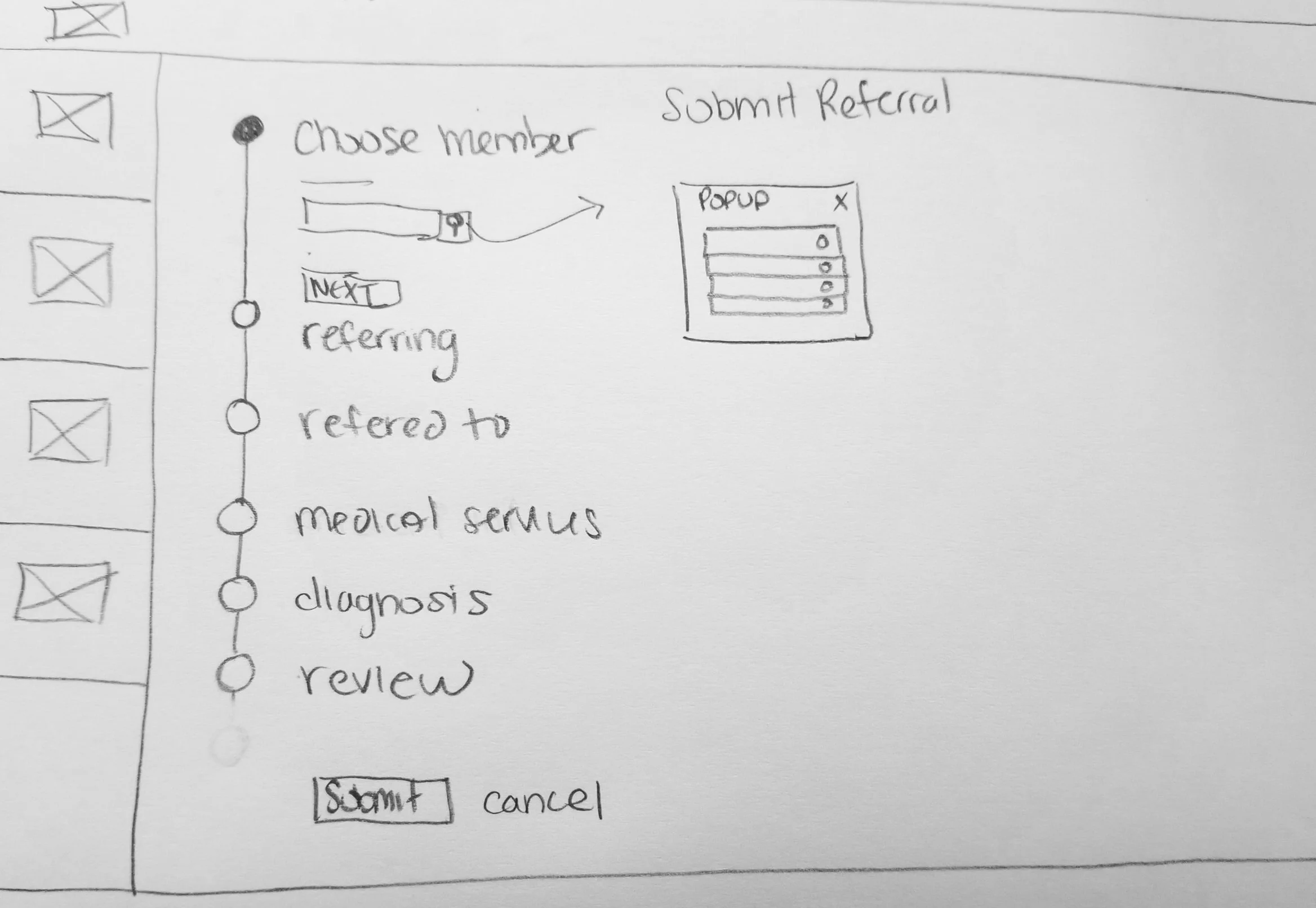
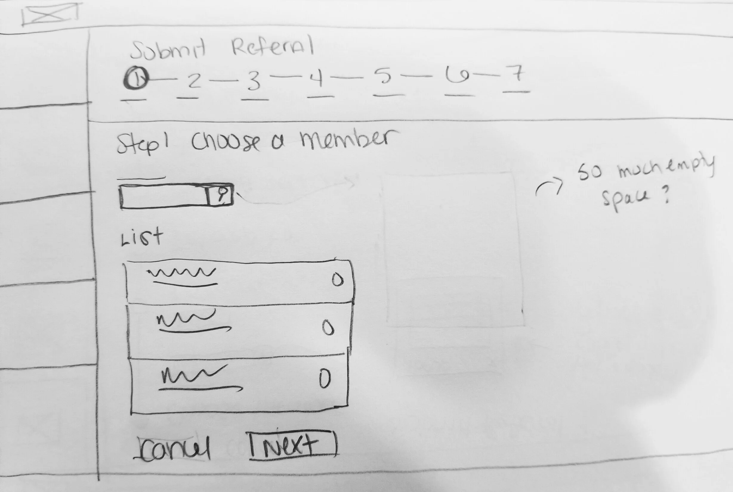
Low Fidelity Wireframes for Testing
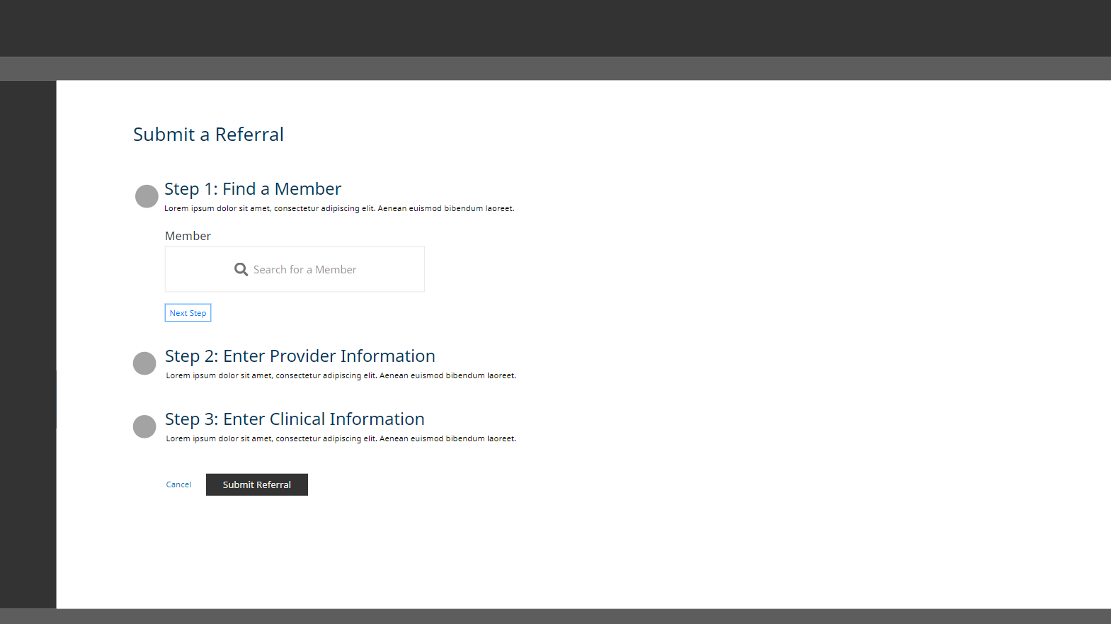
Vertical Stepper Concept
The concept of a user stepping through the form, in 5 steps, all vertically on the page.
Results: Too much development effort and issues when it came to dependent logic from earlier steps.
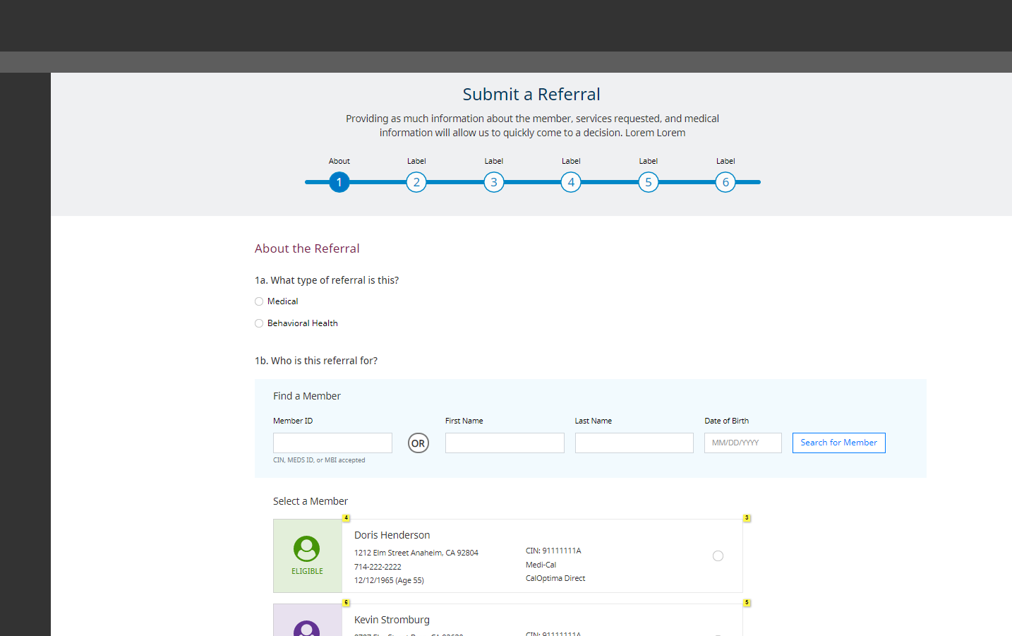
Horizontal Stepper Concept
The concept of a user only being able to perform steps moving forward and horizontally. This required an extra review step to make changes in earlier steps.
Results: Took some time from the user’s perspective, but was technically possible and solved dependency logic.
Designing Out Each Step
Now it was a matter of reviewing each step’s data in Aerial, the data that was gathered from requirements, and coming up with an easy to follow layout. Testing those designs and making changes to solve any glaring issues that appear.
About Section
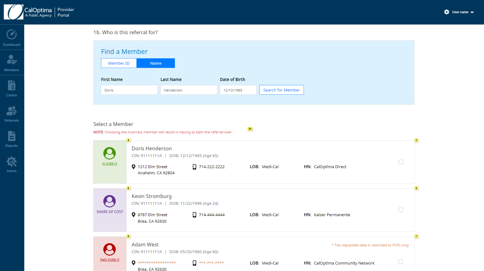
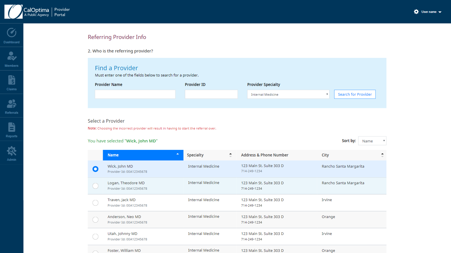
This section is for selecting the correct member. Having an easy member search with proper feedback about the member’s status, clearly communicates what needs to be done.
Changes Made Based on Feedback: 75% of users preferred an easy to see panel over the modal. Based on feedback, we removed the member search modal in favor for a panel.
Before and After FOR THE About Section
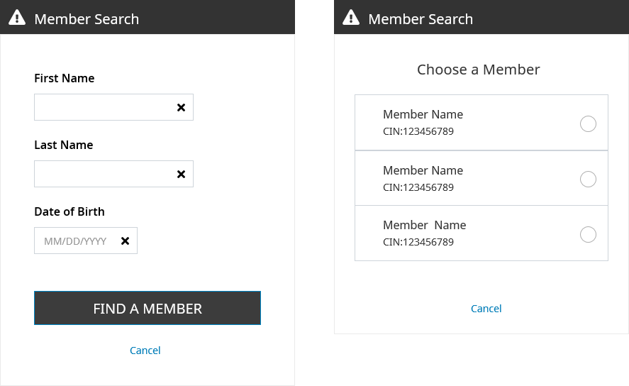
Member Search Modal Concept
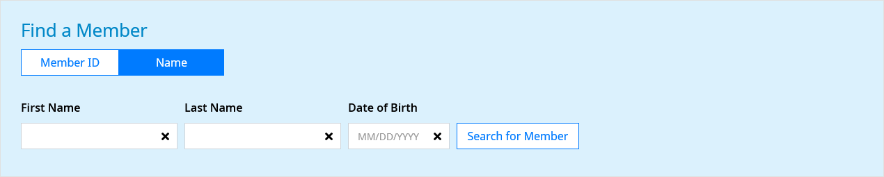
Member Search Panel
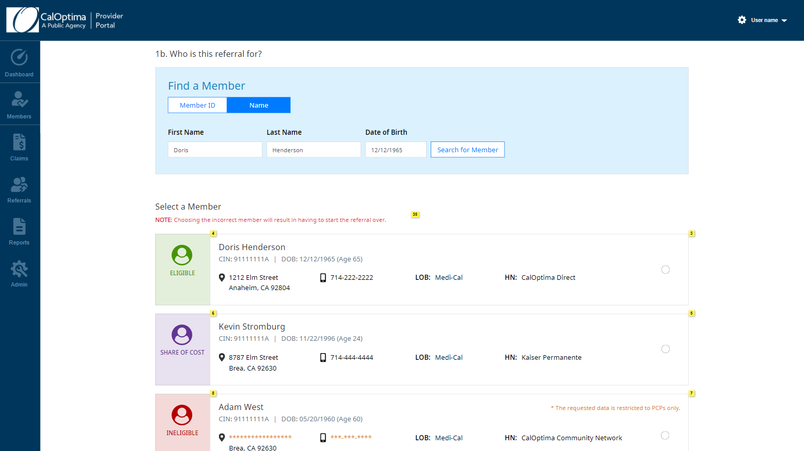
Final Member Search Panel with Changes
Referred To Provider
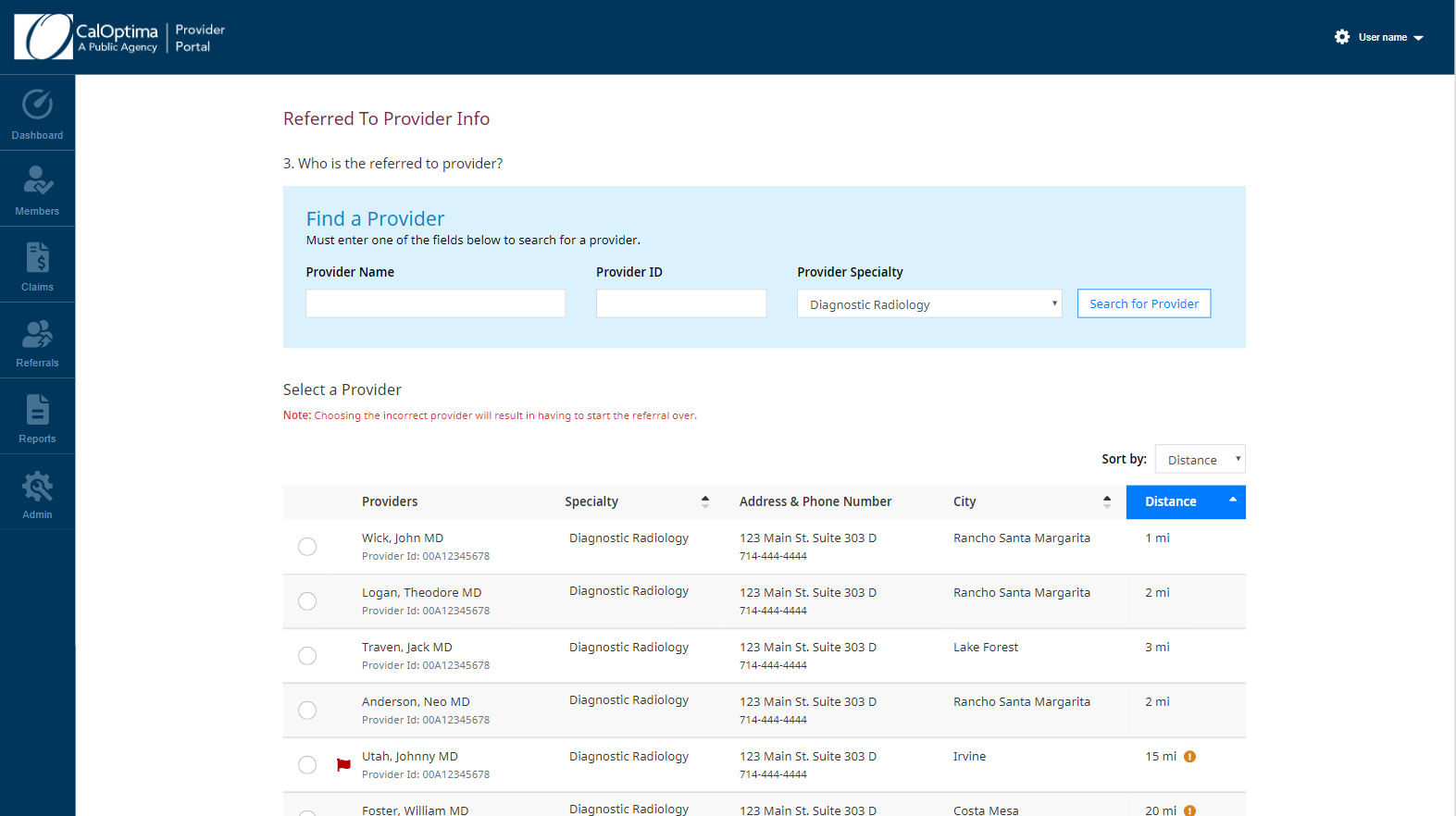
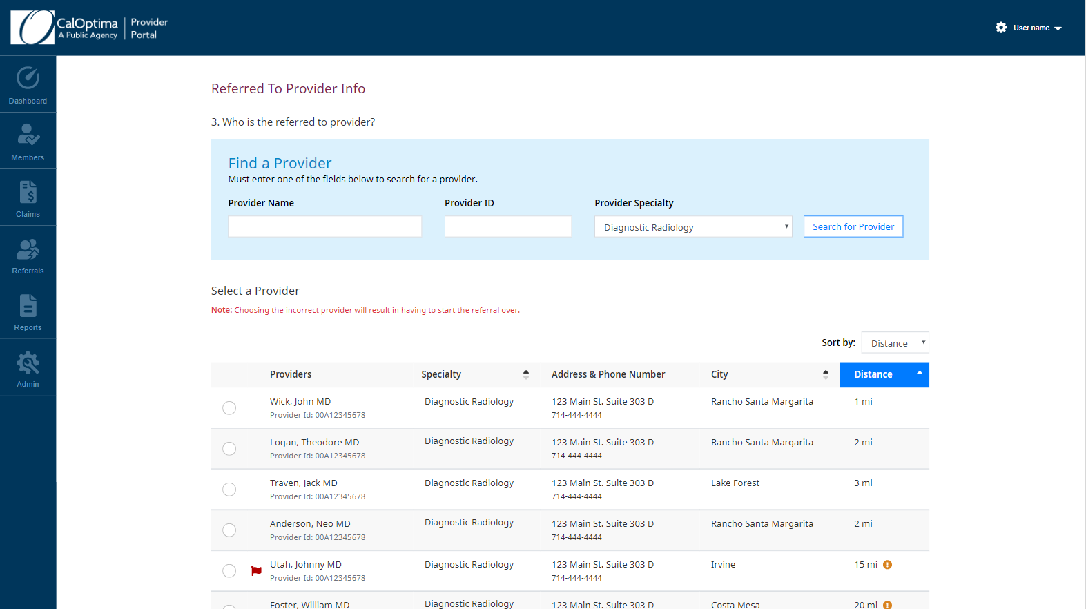
This section is for selecting the correct provider to refer the member to. For the logic, we made it so that the backend limits the providers based on their specialty and referral type. This would be crucial for filtering out the correct medical service in future steps. We also originally had the concept of filtering providers by city and showing how far away the provider was from the member.
Changes Made Based on Feedback: 75% of users wanted more results than filter capabilities. Because CalOptima is only Orange County based, instead of having a whole dedicated filter section by city, the provider list would be sorted by name, city, and specialty.
BEFORE AND AFTER FOR THE REFERRED TO PROVIDER SECTION
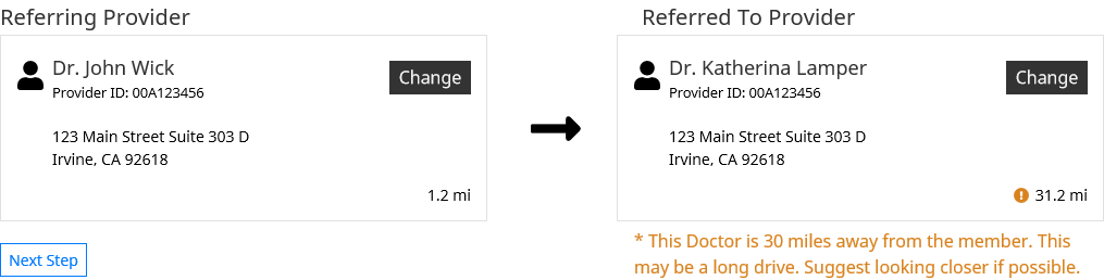
Original Concept for Referring and Referred To Provider On One Page
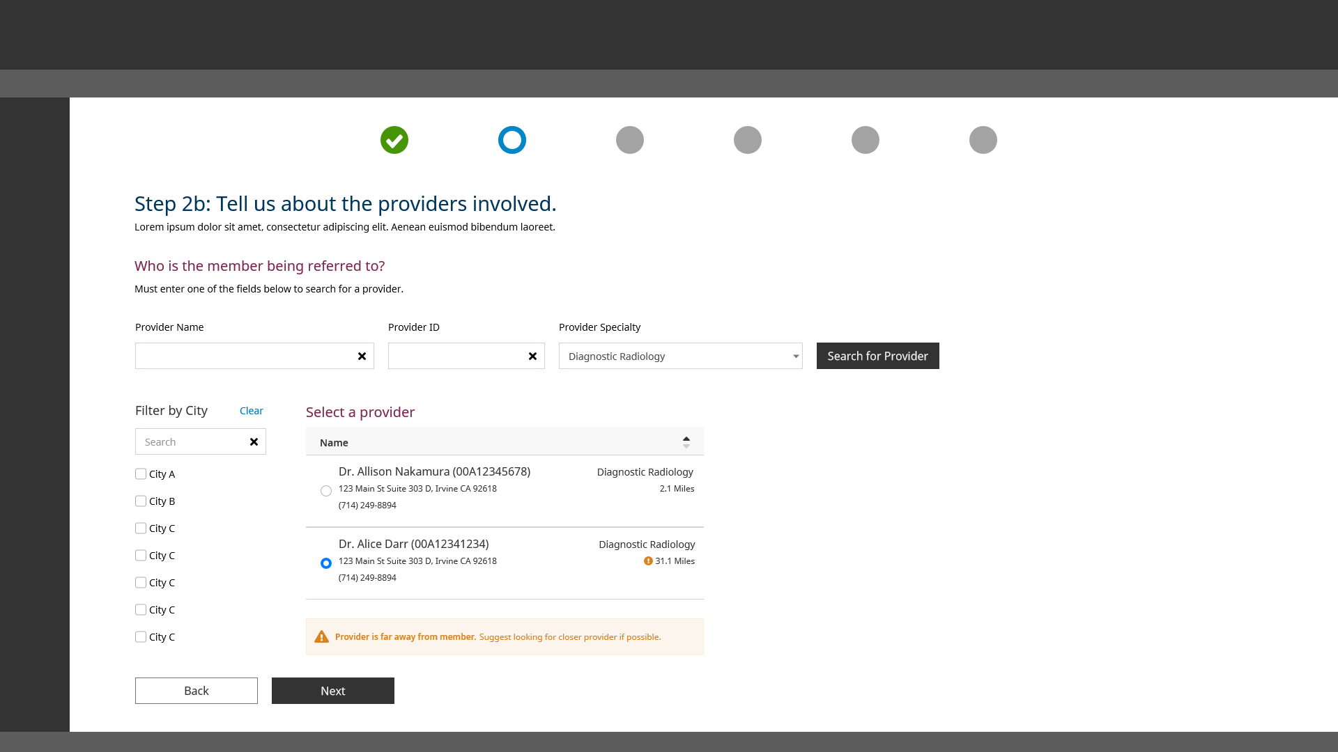
Additional Concept of Filter City
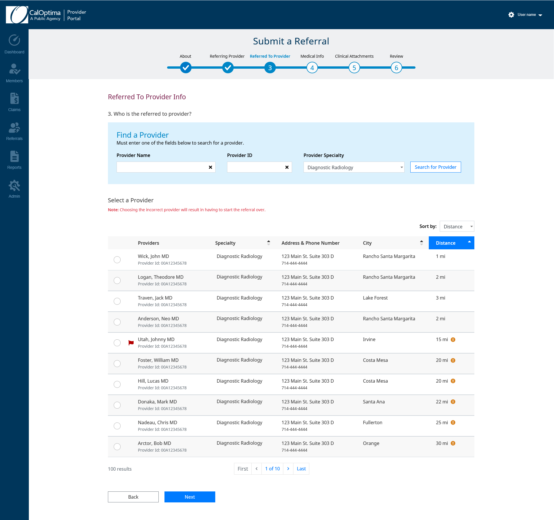
Final Provider Selection with Changes
Combining Steps 3 and 4 for the Medical Info Section
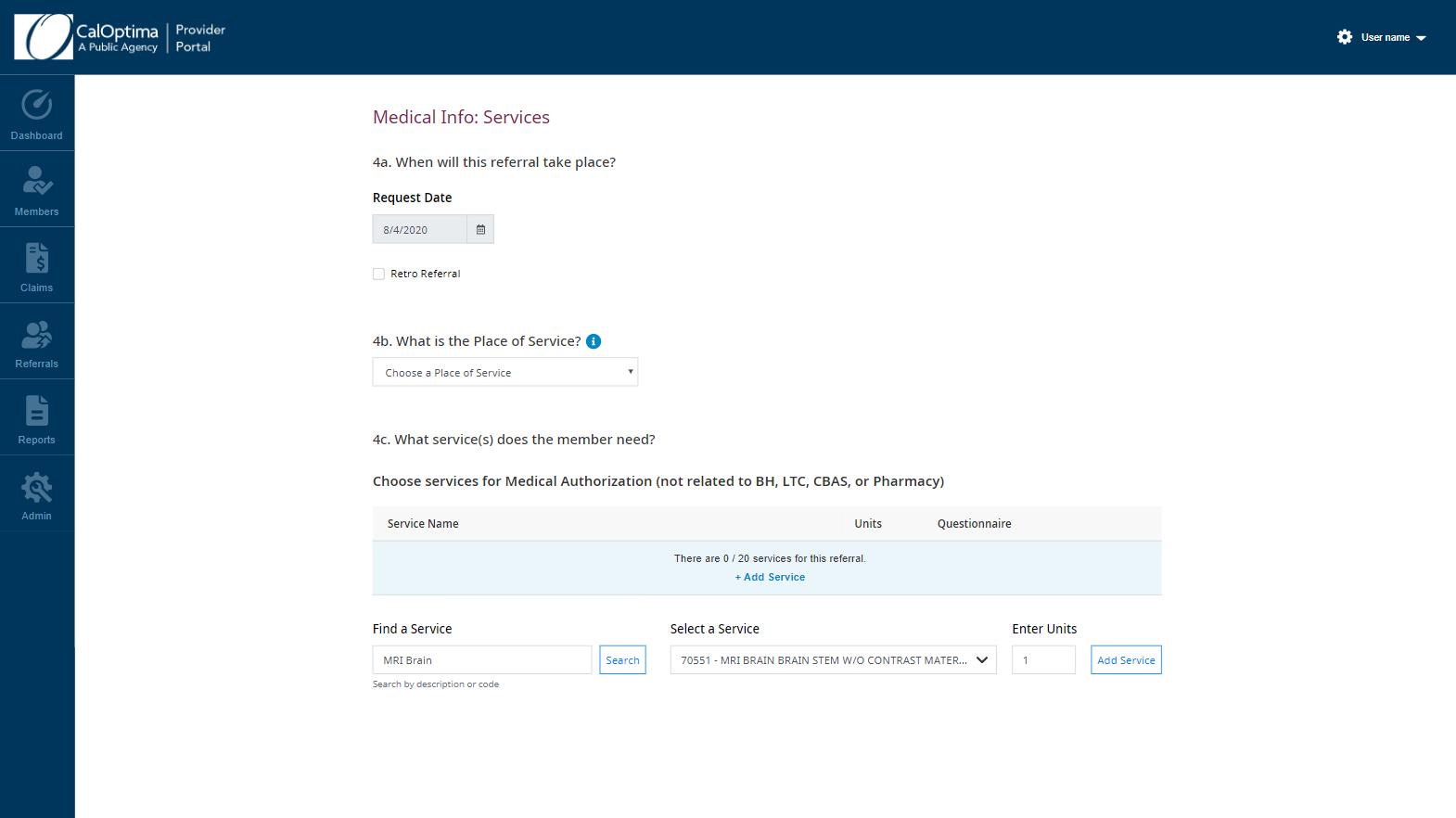
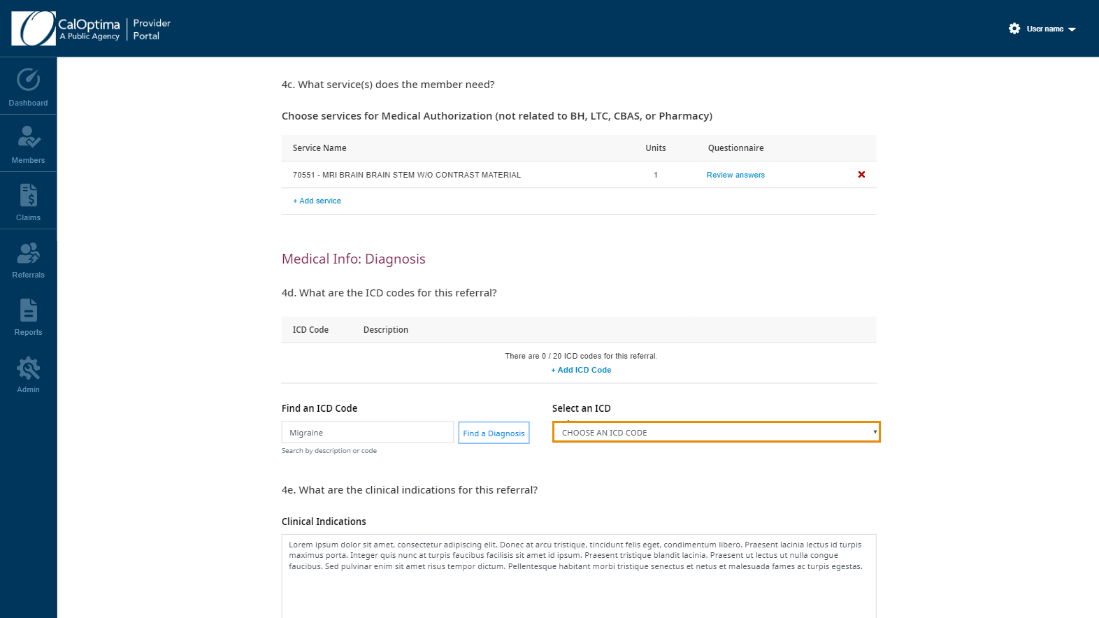
Feedback from nurses and referral coordinators stated that medical diagnosis and medical services were related to each other and should not be separated. So we consolidated the steps into Medical Info. Medical Info requires the heaviest amount of dependency logic when a user chooses their medical services.
Getting Rid of (Optional) Next to Clinical Information
The Challenge: Creating a Clinical Attachments section that would convert more users to voluntarily offer more information. However, clinical attachments MUST remain OPTIONAL.
Normally it is warranted to show users that a field is optional on a form, but this didn’t work out well. The providers kept skipping clinical information making approval times much longer. By removing (optional), creating a check to see if clinical attachments were added, and then giving a warning modal to strongly encourage users, this has helped providers think clinical attachments are required and let’s them know the review process will be faster with the attachments.
Results: Testing with CalOptima employees outside of the Provider Relations Team proved 100% effective. Needs to be tested in full with providers and referral coordinators outside of CalOptima to determine if successful.
CREATING A REASON TO GIVE CLINICAL INFORMATION
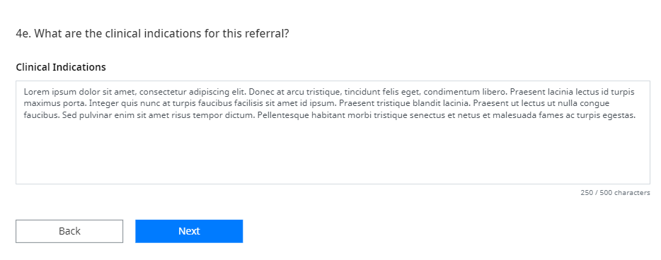
Removing (optional) From Question
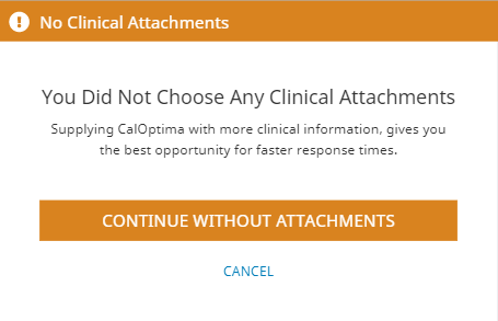
Warning Modal Strongly Encourages Clinical Attachments
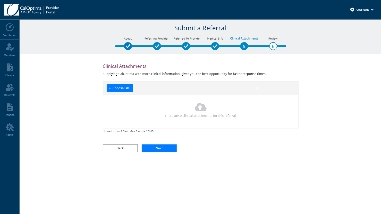
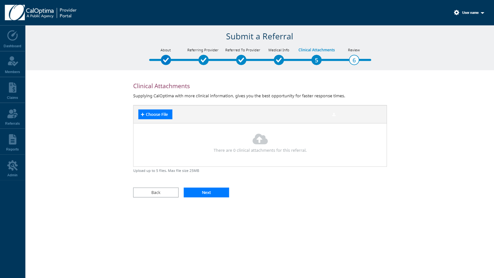
Final Clinical Attachments Section with Changes
Testing the Flow
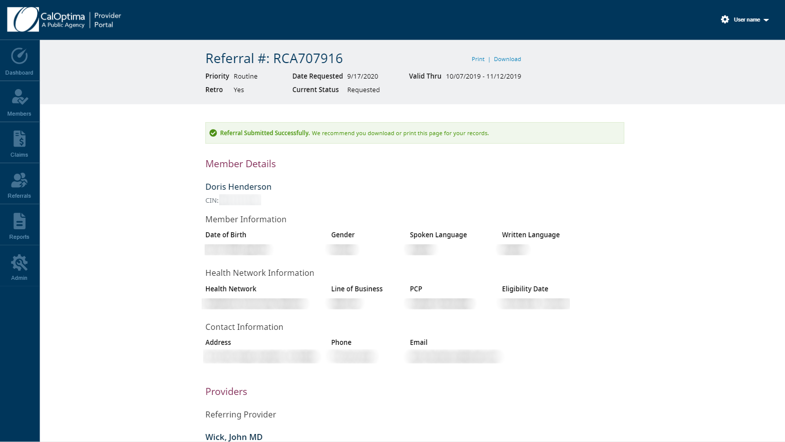
Once submission happened, there were several ways that the submission could fail. It was important to capture all the possible states and give the user the proper feedback. This was tested by creating a wireflow with the possible errors and successes.
Results: It was important to notify the user of both steps to submission. The first step is creating the actual submission, and the second step is submitting clinical attachments to the newly created submission. The wireflow allowed us to catch problems early and have appropriate feedback for those cases.
SUBMISSION WIREFLOW FOR ERROR AND SUCCESS STATES
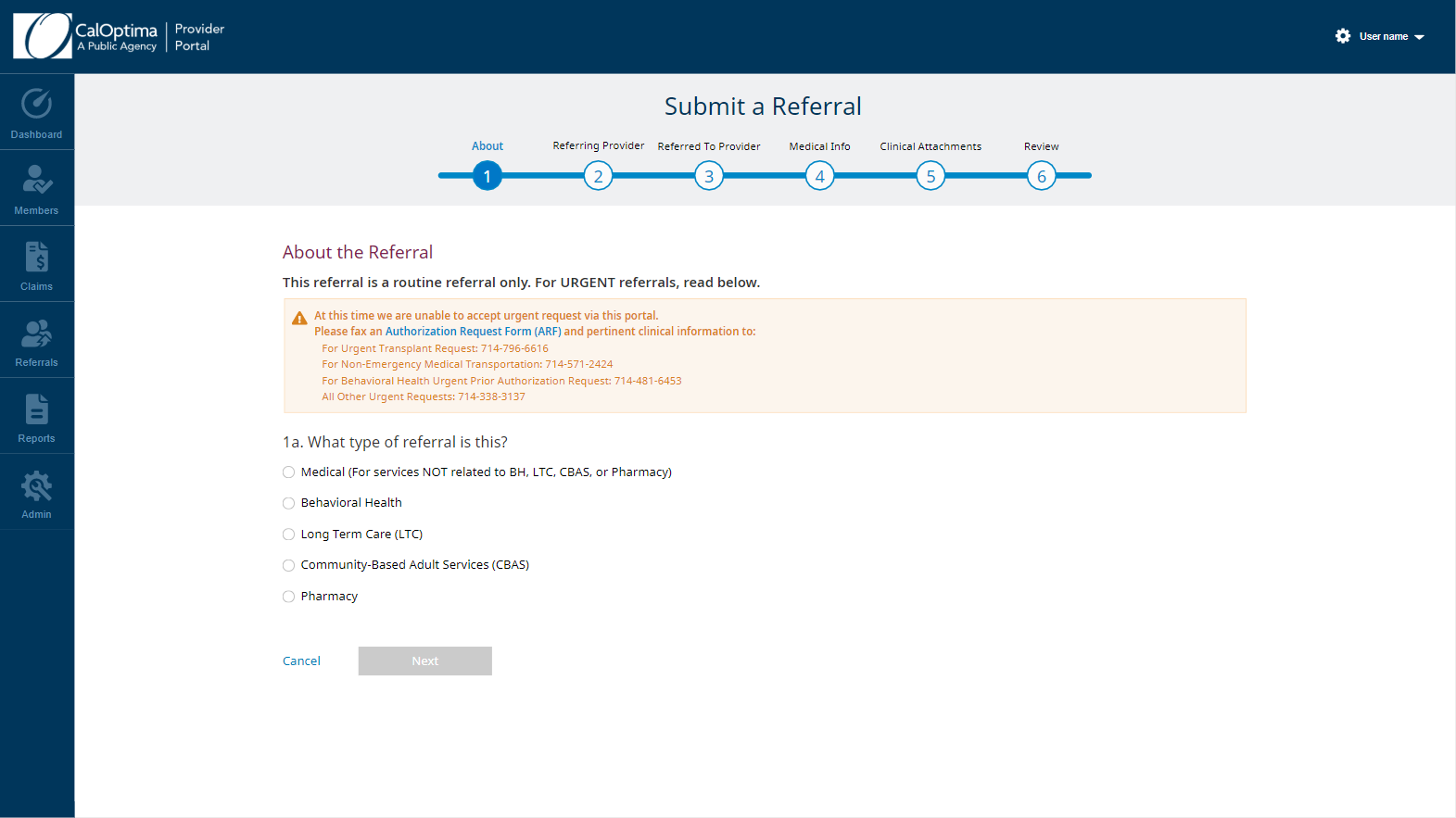
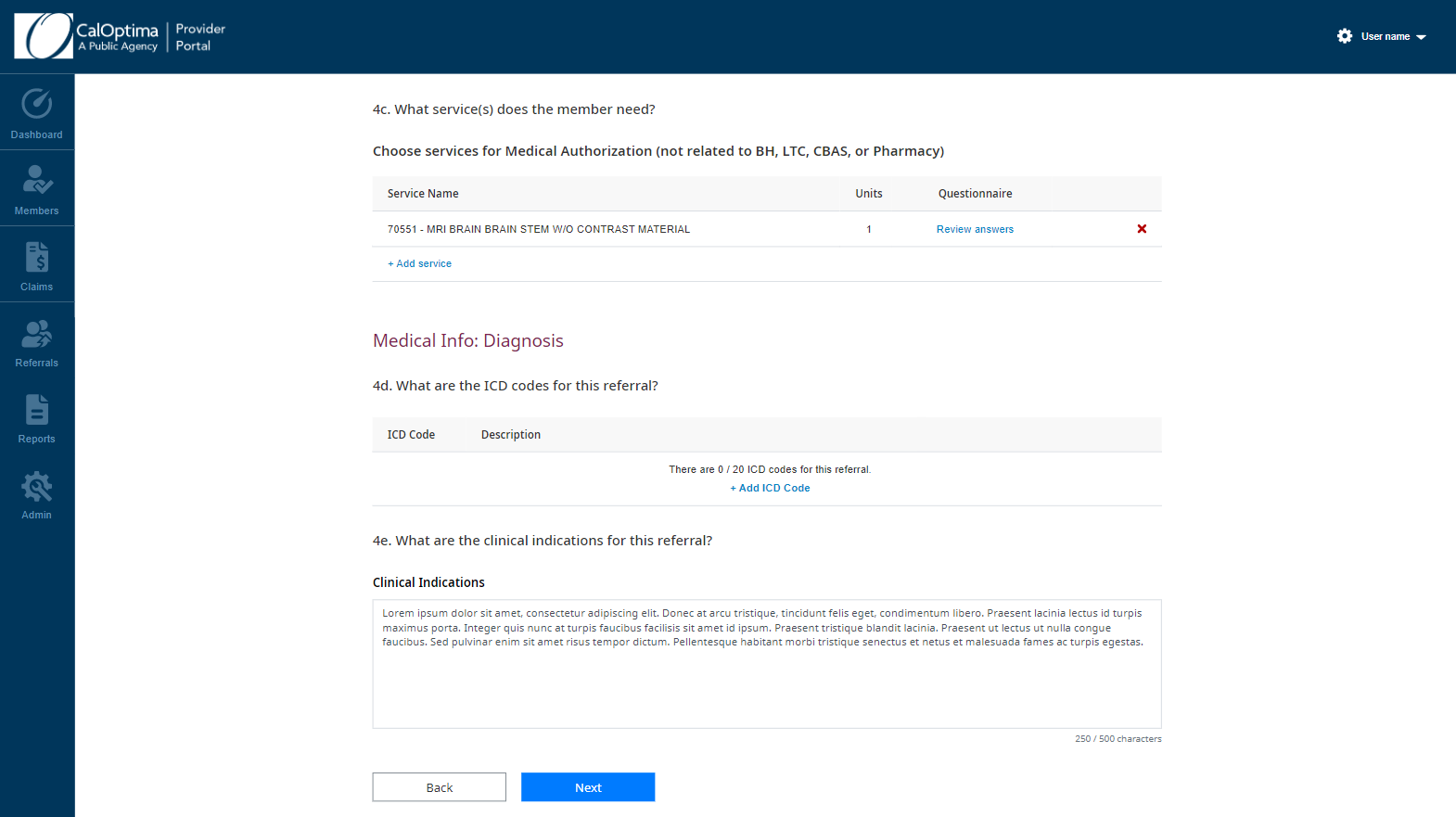
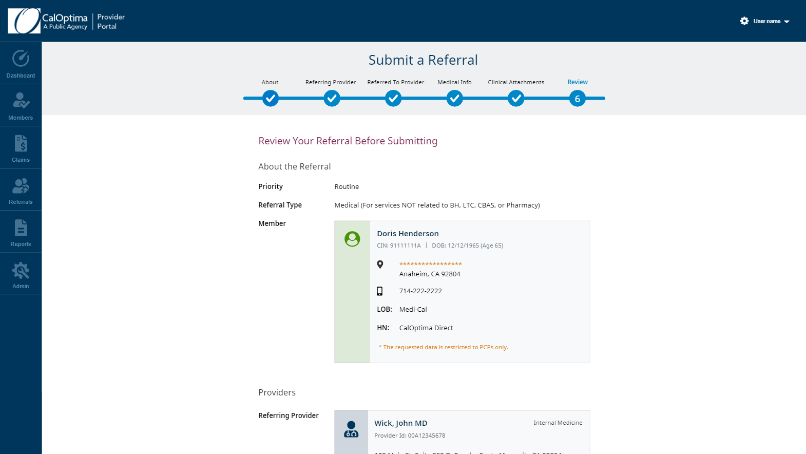
Final Mockups for Referral Submission
The Results
The team finished the first launch of the Provider Portal 1 month early and had plenty of time to perform testing. The business’s plan is to perform a closed launch and slowly begin transitioning a small subset of providers to the new portal for further testing. Eventually all 100,000+ providers would be transitioned to the new portal and the business would save $1.2mil each year.